

Our cell phones are everything to us nowadays! They’ve become far more than a device for distant communication. We use them to shop online, join online courses, search about different topics, find locations, etc. In other words, they are an extension of us. So, it is no surprise that mobile SEO optimization is a necessity for any website that wants to shine through.
In this simple guide, we will uncover the essential techniques you need to know for mobile search engine optimization of your website. From design and UX to accelerated mobile pages SEO and mobile-specific keywords.
Let’s boost your site’s visibility together!
Optimizing your website for mobile SEO is necessary for two main reasons:
So, mobile SEO optimization helps you reach a larger audience, which means more organic traffic and customers.
Now, to start our discussion of search engine optimization for mobile, let’s first go over some common problems websites have when opened on mobile devices. Then, we’ll talk about some strategies to deal with these problems and improve your website mobile optimization.
Mobile users usually complain about the problems below when visiting a website.
These problems cause numerous mobile users to get confused and frustrated and leave your website quickly (high bounce rates). To avoid them, keep the following mobile SEO practices in mind.
To deal with the common mobile site optimization mistakes above, you should pay attention to different aspects of mobile SEO.
The design of your website must be responsive to be able to adapt to different screen sizes and orientations (portrait and landscape) on smartphones, tablets, and desktops. It should also be easy to navigate and access content easily.
So, a mobile-friendly design is achieved by using

For example, in the picture above you can see the difference between the desktop and mobile design of our homepage. Pay attention to the navbar. To make the navigation simpler and save space, we have used a mobile-friendly hamburger menu and hid the phone number.
You can also see how the banner image is optimized to resize and adapt to the smartphone screens. Specifying image dimensions is necessary to make them more adaptable and resize properly.
In addition, the use of scalable fonts has allowed a smooth font resize. The text must remain visually appealing and easily readable on any screen size.
Accelerated mobile pages SEO, or AMP SEO, is an open-source framework to improve the performance of mobile web pages. It mainly includes mobile page speed optimization and mobile user experience optimization.
To optimize a site for mobile, you have to ensure lightning-fast loading times of your website pages. You can meet mobile users’ expectations by
To reduce bounce rates and improve engagement, you should focus on creating a good and positive mobile user experience (UX). An intuitive experience can be achieved by
Mobile users may use specific keywords that are more useful in mobile searches. For example, they can be more location-based. So, you should consider conducting mobile-specific keyword research and identifying mobile users’ intent.
To make sure the content is also optimized for mobile search engine marketing, incorporate the mobile keywords in concise, valuable, and engaging content. You should also consider voice search optimization and include natural language used in voice searches.
Additionally, mobile-optimized content
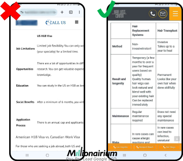
As an example of readable content, consider the websites below. In the left picture below, you can see a table that can’t be read on mobile devices because the content is not optimized properly for smaller screens. So, only the first two columns are visible for mobile users using portrait orientation.
But the website on the right shows the table fully which means better user experience and higher engagement.
In addition to the above-mentioned mobile SEO optimization techniques, to enhance your website’s appearance and visibility in mobile search results, consider the following practices.
You should constantly test and monitor the performance of your website on mobile devices. Try to find compatibility issues and fix them immediately.
Also, use Google Analytics to find out and analyze mobile users’ behavior on your website, conversion rates, mobile traffic, etc. Such insights can help you improve your mobile SEO optimization strategies.
Overall, all these mobile SEO practices improve your website’s visibility not only on mobile devices but also on desktops. This means better ranks and appearance on search results pages, more organic traffic, lower bounce rates, and higher conversion rates.
Now, it’s time for our experienced optimizers to answer some of your most common questions about mobile and SEO.
Basically, the purpose of desktop SEO is to optimize the website for desktop/laptop users, while mobile SEO practices are used to optimize it for users on smartphones and tablets.
The table below summarizes the main differences between mobile and desktop SEO optimization strategies.
| Mobile SEO | Desktop SEO | |
| Responsive Design | Responsiveness is highly important to adapt to smaller screens. | It is optimized for larger screens that do not usually require the same level of design responsiveness. |
| Page Speed | Mobile users need faster loading pages because both the Internet connection and processing power on mobile devices are slower. | Page speed optimization is necessary to enhance the overall performance of the website. |
| User Experience | Mobile users have smaller screens, interact by touch, and prefer simple navigation and on-the-go browsing. | Desktop users use a mouse to interact and have larger screens. |
| Local SEO | Local optimization, GMB, and accurate and easy-to-access NAP information are more important for mobile users as they often search for businesses/services on mobile devices. | It is important to attract targeted traffic and leads. |
| Keywords | Mobile-specific keywords, such as location keywords, informal language long-tail phrases, and keywords optimized for voice search queries are more important. | Incorporating any high-traffic keyword is crucial for content optimization and better ranks in search results pages. |
Yes. At least indirectly mobile SEO optimization affects your site’s desktop ranking because most search engines, like Google, use mobile-friendliness as a ranking factor for both desktop and mobile search results. Besides, if you can engage more and more mobile users, your website’s overall visibility and ranking will improve.
AMP stands for Accelerated Mobile Pages. It is an initiative that helps you create mobile-friendly fast-loading pages. Plus, the AMP framework emphasizes mobile user experience. As a result, you can improve the visibility and performance of the mobile version of your website by implementing AMP.
We have tried to provide the necessary information you need to start optimizing your website for mobile devices. If you are not an SEO professional, mobile SEO optimization can get a bit tricky.
However, you can count on us for a mobile SEO service, among our other services. At Millionairium, we help website owners attract more leads and boost their business without risking losing money on marketing. With our pay-per-lead SEO, you get the leads first, then pay.
Read our ‘Local Lead Generation SEO’ or call (971) 248-0953 for more information.

